While the game is a masterpiece of a-symmetrical gameplay, it had just a few elements missing to truly make this game an unyielding top-fiver in my collection.
A key principle in UX is never to ask a user (player) to have to remember critical information to accomplish a task. While the concept of playing a game is much different than one of, say, applying for a loan (mainly, playing a game is "the voluntary attempt to overcome unnecessary obstacles"), it still shouldn't feel harder than what it is trying to do. In this case, the game mechanic of trying to figure out where is the Rebel Base through the process of elimination is hindered by the biological difficulty of holding more than seven items in one's short-term memory. If this was a memory game, with the whole function of the game centering around said memory, then ok. But it isn't - so - I created a simple aid to help the player mark each planet about the possible use of each planet by the Rebel player:
1. A probe icon to represent the Imperial player's collection of reviewed Probe cards.
2. An Imperial icon to represent "troop on the ground". This is significant because while the Imperial player can tell a planet isn't the Rebel base through this method, it could still be if the card is in the Probe deck.
2. An Imperial icon to represent "troop on the ground". This is significant because while the Imperial player can tell a planet isn't the Rebel base through this method, it could still be if the card is in the Probe deck.
The map was designed to fit on a standard notepad size, with the sector lines taking a higher priority (through contrast) over the planet name and graphic.
Galaxy map notepad for the Empire player
The game's galaxy sector boundaries provide enough space for small skirmishes (as is thematically they should be) but often times in my games the skirmishes tended to be.. larger. I created this "Battle Mat" (designed to be printed on a mouse pad. Remember those?) to provide both a thematic game component where these battles can take place while allowing for the physical space for the miniatures, as well as act as a context-appropriate cheatsheet for the unit's rolled dice and hit points (noticeably dropping the production cost).
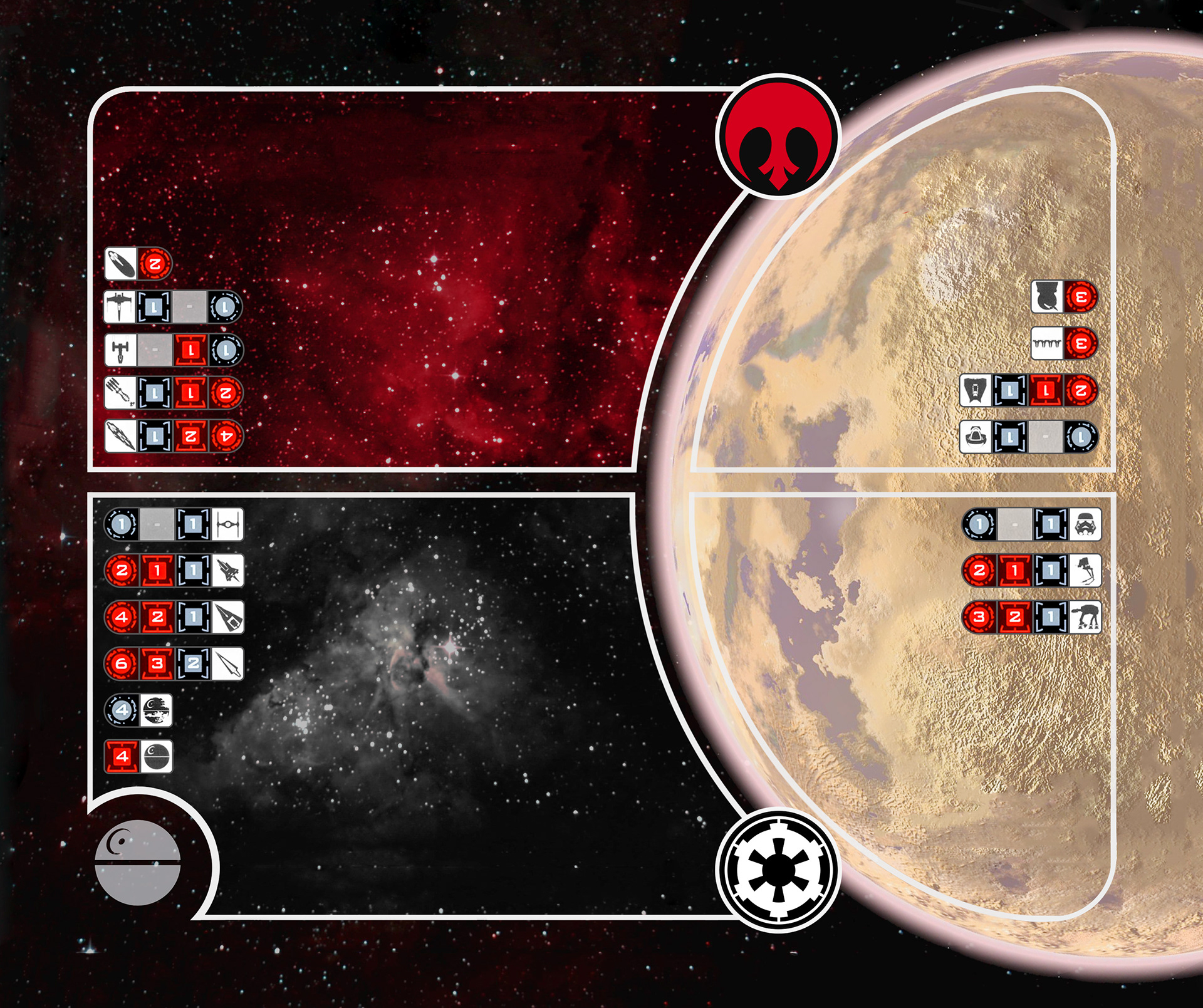
Base game battle mat
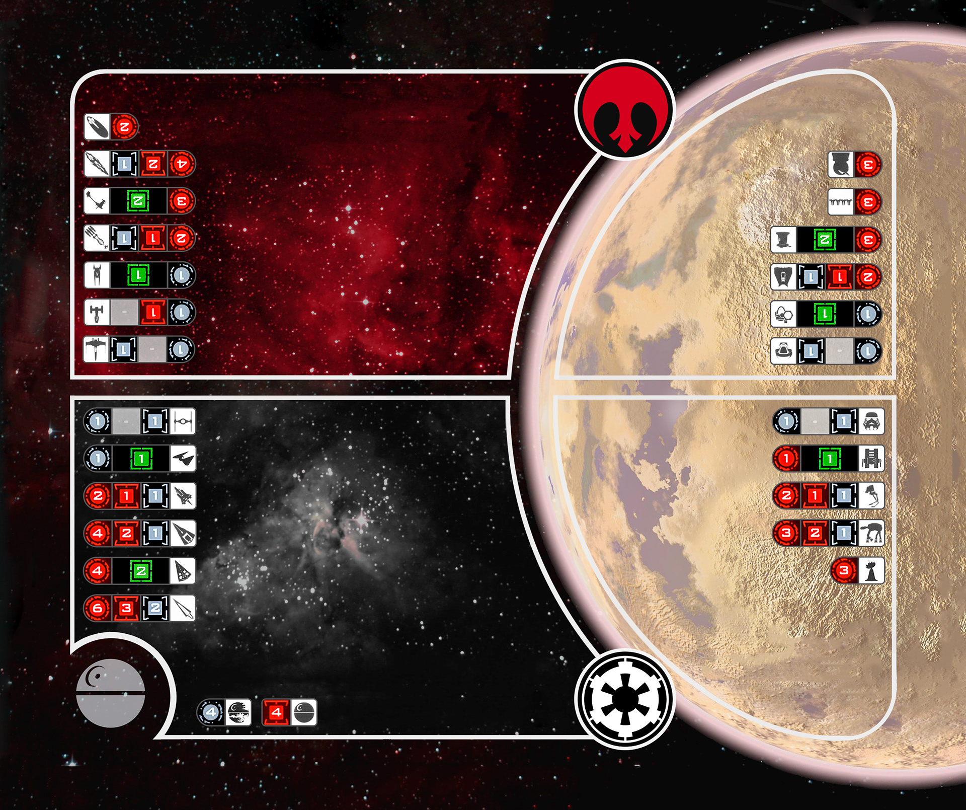
Base game + expansion battle mat
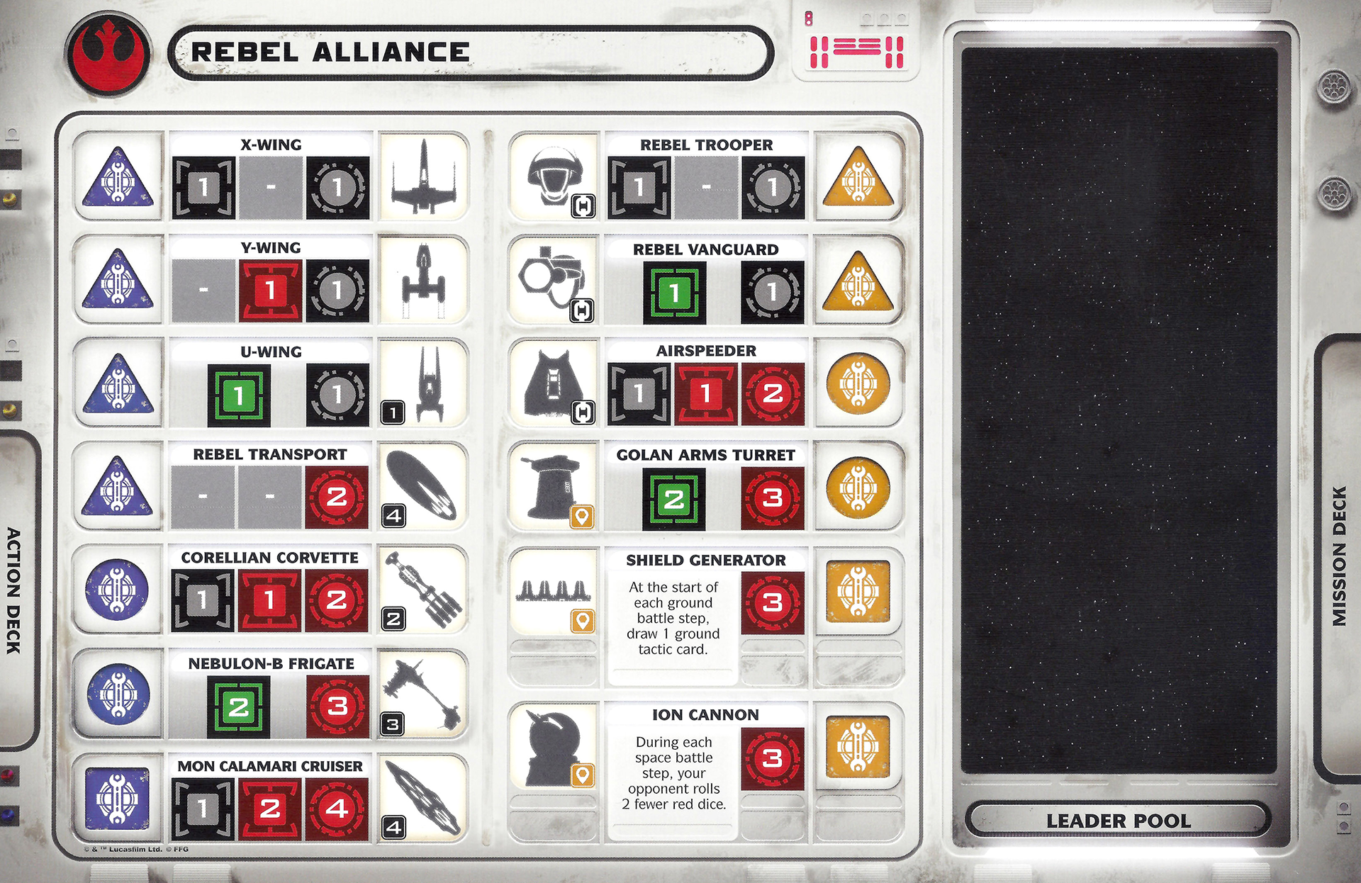
These rearranged Player Boards were designed for a 1v1 game, and combine the two original boards (base game + expansion) into one board each. Noticeably, I dropped the secondary play "space" because I play this game exclusively as a 1v1 game (not 2v2).
