This design aims to provide a concise and easily accessible quick reference aid for players. The player aid features clear and organized sections, with each rule or gameplay element presented in a straightforward manner. Icons are incorporated to enhance understanding and serve as visual cues. A visually appealing layout with appropriate colors and fonts makes this player aid visually engaging and inviting to use.
Overall, this design prioritizes clarity, simplicity, and visual appeal to assist players in playing the game, and simply have fun.
This is another entry in my "solo-first" player aids series.

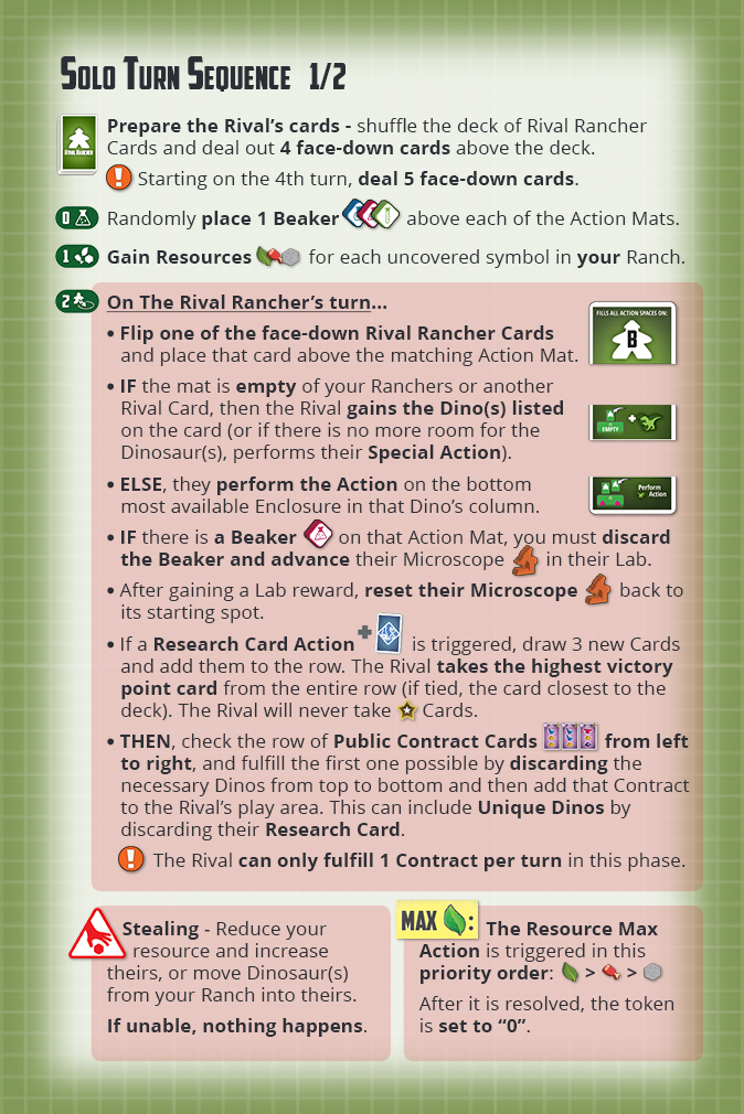
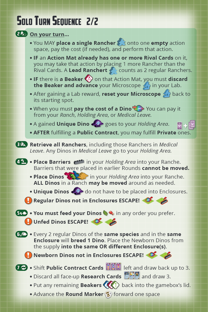
While my goal is normally to create these as a two-sided print (one side explaining the "setup" pre-game phase, and the other the "turn sequence" mid-game phase) There was just too much info in this game to fit them all on just two sides that also fit the tiny (but epic) game box.
