Stonespine Architects box art | Photo by Kirk Dennison @kirklandsigs
Overview
A card-drafting game (1-5 players) in which each player builds the most dangerous labyrinth beneath the Stonespine Mountains.
I consulted for Thunderworks Games as a UX designer.
My Role
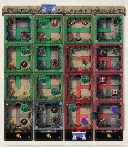
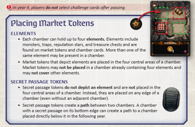
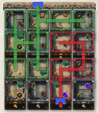
•Reviewed the full rulebook: reorganised sections for better flow, added diagrams to illustrate drafting and board placement phases, rewrote sentences for clarity and accessibility.
•Audited all components (cards, tokens, market board, blueprint cards): improved icon readability, adjusted color contrast for better legibility in low-light settings, refined layout margins and line-heights in card text.
•Streamlined turn sequence: suggested removing redundant player actions, clarified timing windows for drafting vs building phases, and improved guidance for new players.
•Ensured accessibility: improved rulebook typography hierarchy, added icon legends near the back of the book, provided color-blind friendly version of key component icons.
•Graphic/layout tweaks: provided feedback for the production team to adjust card back design for easier sorting, adjusted token colour palette to reduce visual confusion, refined page margin and rulebook flow for better reader scanning.
Outcome / Impact
The changes led to a tighter onboarding experience for new players, fewer rule-clarification questions in play-tests, and improved clarity of component symbols — all contributing to smoother rules teaching, better player retention, and a pleasantly memorable experience overall.

The original tokens were lighter with a "laser etched" icon effect that didn't fit the theme
Photo by @MGBoardGames
Output example:
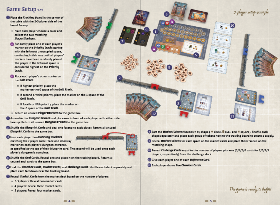
Original layout
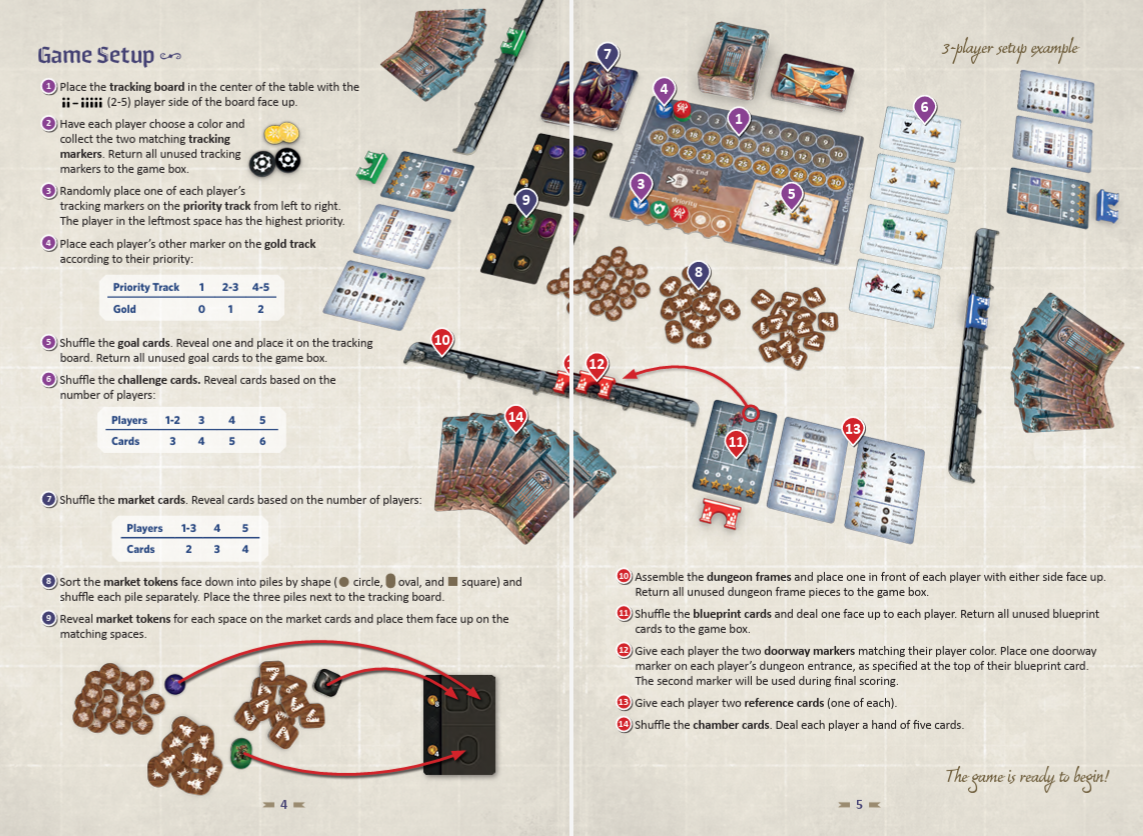
Layout and copy with my proposed changes
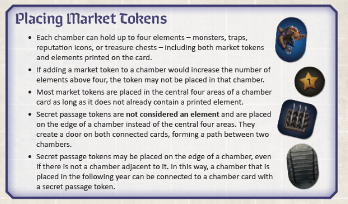
Original layout
Layout and copy with my proposed changes
Original layout